Gork@lemm.ee to Science Memes@mander.xyzEnglish · 2 months agoAlso P!=NPfiles.catbox.moeimagemessage-square30fedilinkarrow-up1395arrow-down19
arrow-up1386arrow-down1imageAlso P!=NPfiles.catbox.moeGork@lemm.ee to Science Memes@mander.xyzEnglish · 2 months agomessage-square30fedilink
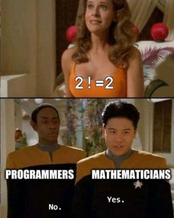
minus-squaredohpaz42@lemmy.worldlinkfedilinkEnglisharrow-up16·2 months agoThis is why fonts and kerning are so very important. But then again, the text in the boobs looks like it has extraneous spaces deliberately to look like that. There is a noticeable visual difference between 2! = 2 and 2 != 2 when spaced properly.

This is why fonts and kerning are so very important. But then again, the text in the boobs looks like it has extraneous spaces deliberately to look like that. There is a noticeable visual difference between
2! = 2and2 != 2when spaced properly.