Crouton@jlai.lu to Lemmy@lemmy.mlEnglish · edit-27 months ago[Suggestion] Language selectionmessage-squaremessage-square13fedilinkarrow-up128arrow-down12file-text
arrow-up126arrow-down1message-square[Suggestion] Language selectionCrouton@jlai.lu to Lemmy@lemmy.mlEnglish · edit-27 months agomessage-square13fedilinkfile-text
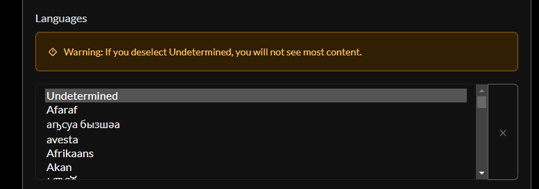
Hello, I think it would be possible to improve the user experience of the language selection box. Now: Suggestion: Your browser does not support playing HTML5 video. You can download a copy of the video file instead. Here is a description of the content: mockup of a new type of language selection
minus-squareCrouton@jlai.luOPlinkfedilinkEnglisharrow-up6·7 months agoUnfortunately, I’m not a web dev. I can only tinker with a few things.
minus-squaresugar_in_your_tea@sh.itjust.workslinkfedilinkEnglisharrow-up4·edit-27 months agoThe list is super long, any good ideas on breaking it up? Or just allow typing to filter? I’m a fullstack dev, and I wouldn’t be opposed to throwing a PR up for something like this. No promises though.
minus-squareCrouton@jlai.luOPlinkfedilinkEnglisharrow-up1·7 months agoTyping to filter seems the best idea in my eyes. The only other possibility I can think of would be subcategories, which wouldn’t help much.


Unfortunately, I’m not a web dev. I can only tinker with a few things.
The list is super long, any good ideas on breaking it up? Or just allow typing to filter?
I’m a fullstack dev, and I wouldn’t be opposed to throwing a PR up for something like this. No promises though.
Typing to filter seems the best idea in my eyes. The only other possibility I can think of would be subcategories, which wouldn’t help much.