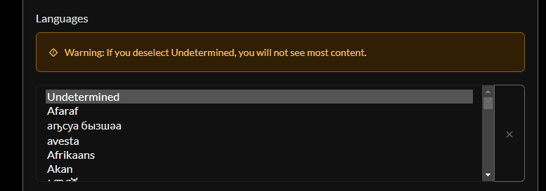
Hello,
I think it would be possible to improve the user experience of the language selection box.
Now:

Suggestion:
Pull requests are welcome.
Unfortunately, I’m not a web dev. I can only tinker with a few things.
The list is super long, any good ideas on breaking it up? Or just allow typing to filter?
I’m a fullstack dev, and I wouldn’t be opposed to throwing a PR up for something like this. No promises though.
Typing to filter seems the best idea in my eyes. The only other possibility I can think of would be subcategories, which wouldn’t help much.
Second image is not loading for me. On Jerboa
Second image is a webm. Gif are automatically converted in webm, si I can’t do anything.
Open a pull request?
Sure! You give me the changes to make? I’m not a web dev.
And that’s why Lemmy development is slow, lot of people have suggestions, but only a few can implement them
Do you mean I shouldn’t give suggestions since I’m not able to implement them myself?
In that case, Lemmy should remain a project for web developers and not be open to the general public.
You can make all the suggestions you want, but realistically they are probably not going to get implemented before a very long time, if at all.
I was aware of that before even posting my suggestion, and I totally understand it.
All good then!


