
Credit: Mr. Lovenstein :: Over the Line | Tapas Comics
RSS Feed: https://tapas.io/rss/series/3346
Bonus panel (animated gif, wait for it)
Just do the same to the other letters, so it looks like a stylistic choice.
Yeah, I just like to sketch every letter… it’s totally on purpose.
The second one actually does read easier, and that’s because with characters it’s the thought that counts
Then I try to erase the whole word and rewrite it, but you can still see the D after I erase it so it looks even worse
i have a erasable pen (via friction thing)
Fun fact: these pens don’t actually erase, they just use heat to become invisible
Same diff
Cool info tho
Who writes TODAY in All capitals on paper?
What happens more often is my sloppy 6 and 0 look too similar.
Every damn time…
Every oamn time
Every olamn lime
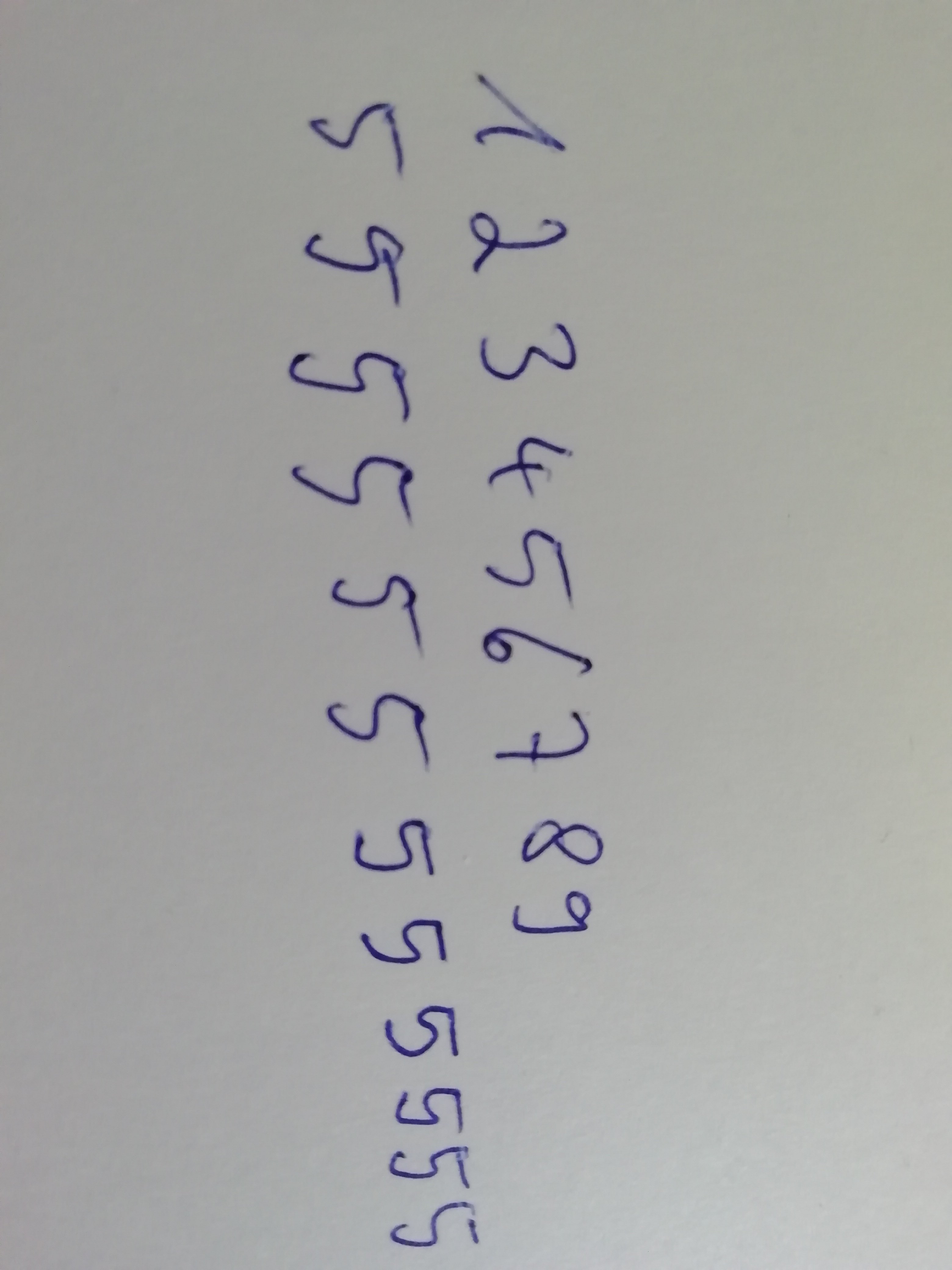
My 5 and S look the same
My 5s are apparently unreadable for most people. Whenever someone asks me what that sign or letter is on anything I wrote I will say it’s a 5 without looking. They’ll say how I didn’t even look. But it’s always correct.
Your 5 is just a fucked up b, right?
No, it’s a 5. Idk why people don’t see it.
attach pic of your 5 and let lemmy judge
