
Hi, where else can I upload this image to illustrate what I mean?
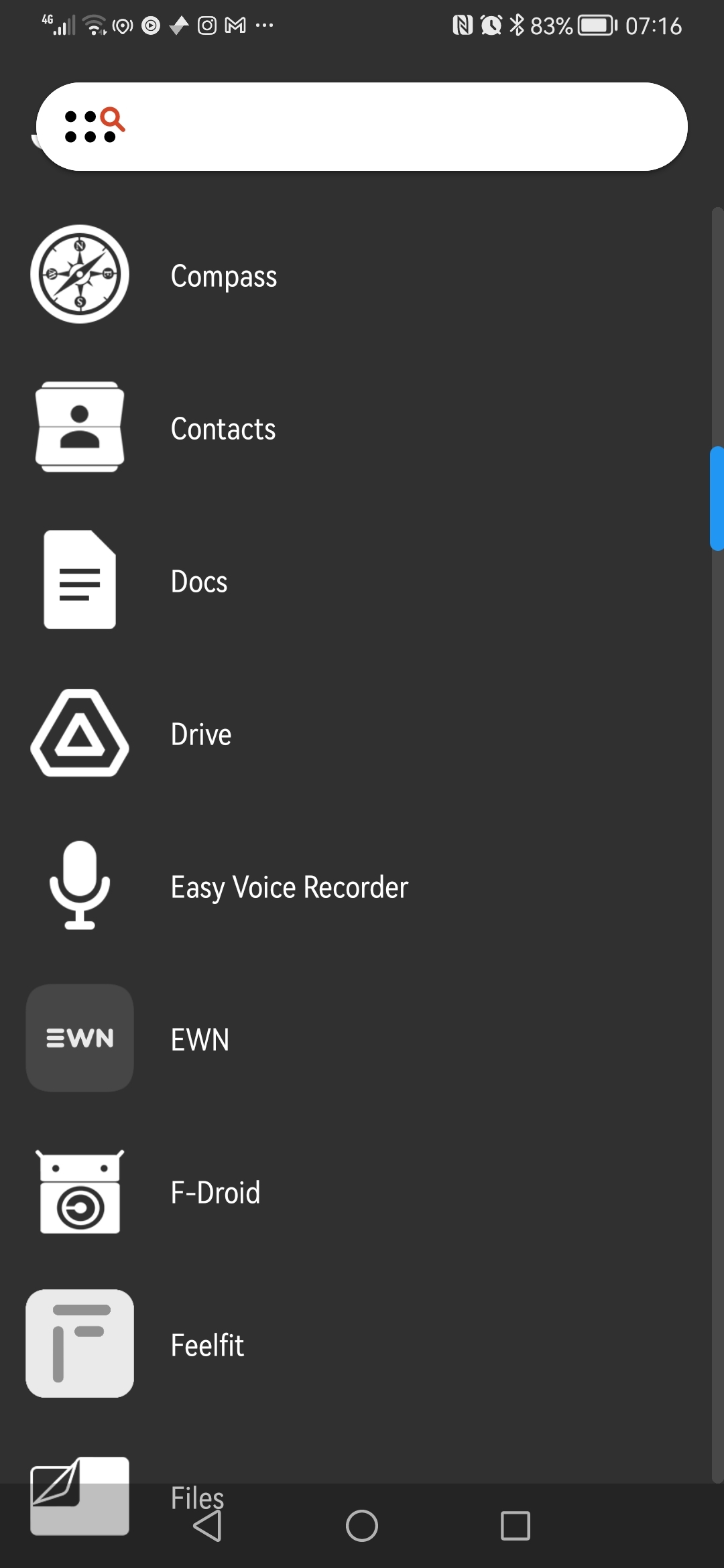
This is UI on my nothing phone. I see a major benefit for my everyday mental wellbeing to not have my phone shooting at me with all colors, and instead being “just a good interface”.
There might be some issues with icon recognition and speed of access, but since that’s your device and your icon placement, you eventually getting used to it. In exchange you receive a clean UI which doesn’t overload your receptors, which is a very important thing for the device you look at often.
Weather widget in the middle often shows calendar events, but I don’t discolse that for privacy.
Thanks for listening to my TED talk.
Nothing to see here, folks…
While I’ve heard mostly good stuff about Nothing, I noticed an interesting tidbit about early investors on Wikipedia:
raised $7 million from investors including Tony Fadell, Kevin Lin, Steve Huffman, and Casey Neistat.
Steve Huffman of Reddit fame, as a Lemmy denizen I’d say not ideal to be pouring more money in his pockets lol
I only can say… Fuck spez
I just want a feature phone that can act as a wifi hotspot for my laptop.
I would like to have a Project Ara without Google buying it up and doing some good PR only for it to disappear forever. Project Ara was presented by Google in 2014 and was a modular smartphone where all components could have been replaced…
Isn’t it standard on all phones?
That’s what I was gonna say. Like my pre iPhone smart phone had bluetooth and wired hotspot.
feature phone. slangly called a dumbphone. basically I want something that is by and large only a phone but just add ability to get my laptop online with it.
looks very clean
Thanks! It is. Maybe their launcher is just available for all Android phones. Or there are other monochrome launchers.
You can do the same monochromatic thing with nova launcher and whicons
Awesome! I am glad I have your comment in my history. If I ever change phone to another android, I will come back to it, so I know how to swap to monochrome :3
Look it doesn’t look as good as your UI, but it’s as close as I could get to the monochrome look that I wanted, The widgets still have full colour:

That looks neat, what is the launcher name?
It’s nova launcher, paid, but worth it. Also has the nice side effect that when you move to a different phone tour UI remains the same
BankID spotted!
Jo. Proprietary foundation of Swedish society.
Why two clocks and weather-widgets?
I have one. I hated the stock skin. I like having the apps I use regularly groups together by purpose on my home screen so I can get to them quickly. I immediately re-skinned it.
Does the phone have a built in battery charge limiter or do you need to root for that? I leave my phone plugged in all day/night running stuff and I really don’t need it at 100% 24/7. I think that’s the only thing I need root for at this point. Nothing else I want to run needs it anymore after android 13 finally added the ability to toggle airplane mode on and off WITHOUT root.
Yeah, I checked now. Recently learned about this feature from reddit, and just checked it to find that it is activated already on my phone.
It has “smart charge mode” to gradually charge overnight, and “Custom charging mode” to not charge it to 100%. Maybe I should activate it.
Thank god. Whoever decided that “smart battery charging” should only ever be automatic, and can’t be hard capped should be quartered. Thank god more companies are finally giving people the option. Especially since it apparently goes all the way down to 70%. This might be what gets me to finally retire this poor phone.
How is notification center and phone?
Is it the one you see when you slide down?
That one is still bombarded by notifications from applications, so I simply have “Do Not Disturb” mode on almost all the time.
It also allows to disable notification by holding it, but it is like that on all phones, I assume.
It has support for silent notifications also, but I kinda just nuke whatever new thing pop ups there.
And also it has customizable buttons for features with the ability to change size and placement. Quite neat.
Nice! I have Bern struggleing to get a clean UI. But my notification area is always cluttered 😅
If you’d like to have a bit more control than just either turning on/off/hide classes of notifications as provided by Android, I recommend getting Buzzkill. There’s a few other apps that does this but I don’t remember their names.
But basically the gist is that you can set rules for notifications by app basis, if-then arguments and a few other methods I didn’t touch on to control how notifications show. Batch them together every few hours. Block them from showing during certain time periods and/or days. Mute notifications for a few minutes when that one guy in the group chat that likes to send 1 sentence in 100 lines.
I’m not sure if Buzzkill is open source or not; I can’t recall if I ever checked it.
And it’s like constantly 50 notifications you never asked for stacked in the endless columns of meaningless information, regardless how often you disable them :D
But I simply nuke whatever pop ups. Keep sms, and emails.
I also thought that’s standard, but that UI also allows to customize and disable them per category when you hold your finger on the notification. So I can disable everything, but keep direct messages, for example.
You should be able to long press unwanted notifications and stop the system showing that class of notification or all notifications from some app
“Turn off” stops that class of notification from that app
Settings gear takes you to the notification section of the app that threw the notification and toggle any or all of that apps notifications
You can also get to the notification a couple of other ways:
- Settings/apps go to whatever app’s settings including notification settings
- In your switch application view tap the icon above the app’s card
Yeah, exactly how it works.
As far as I can tell they’re stock from Android
Nah, this is just a random complaining video for the sake of complaining.
Complaining about the default button size for the panel where you can change button size is just making an unnecessary noise. It is intentionally done like that to force you to change their size so phone becomes yours.
If something is using dots motif, it doesn’t mean everything else should automatically use dots, it would look be silly. Different locations on the phone use different visual style, that’s okay.
Then it goes into glyph selection and missing actual glyph selection setting.
Why not gesture navigation?
Honestly, that’s too hard for me to figure out how to setup without knowing the outcome.
Is it good and worth to dig in?
Yeah and I think it’s pretty easy to do so. And easy to go back if you don’t like it
Can you use something like the kiss launcher to make it text based and no icons
No idea, that’s android, so probably. That view is their official launcher, but my phone came with default android looks.
I’ve been using T-UI for probably 8+ years now. It hasn’t been updated in ages, but it really doesn’t need to be.
I’ve even built it out by creating a tui folder with empty files in it. Tasker has tasks set to execute when the files are modified, and T-UI has aliases set to touch specific files if commands are entered.
Why two clocks and weather-widgets?


