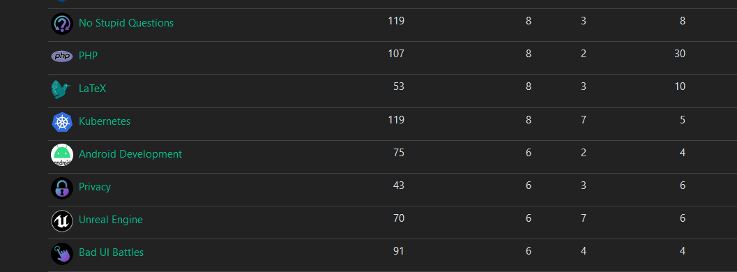
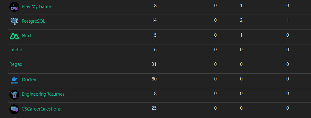
Ive been working on some unified icons for the instance so the icons feel like they belong together
Let me know if you like them or if there’s some adjustments I should make
Some examples from ones I’ve done


The majority of them are generated from https://game-icons.net/ with the settings of foreground being shrunk twice and position being x:2 y:2. Foreground color is diagonal from 2EE5D2 to A01FC5. And has a shadow with color 423025 and blur set to 15. The background color is just black


I hope you don’t mind, I made one for the XR Dev community (made a banner as well). At first it had a different colorscheme as I didn’t know about icon guidelines but now have updated it accordingly: https://programming.dev/c/xrdev
Alright yeah that one looks great
There isnt technically icon guidelines yet until the icon poll in this post finishes https://programming.dev/post/190520
Once thats done ill be switching the communities like meta, programming, and the new ones over to whatever style wins