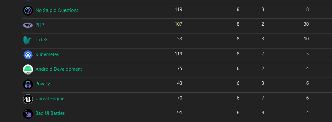
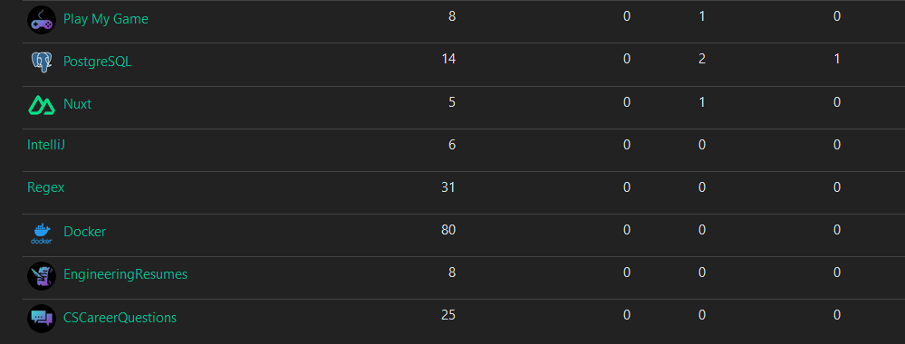
Ive been working on some unified icons for the instance so the icons feel like they belong together
Let me know if you like them or if there’s some adjustments I should make
Some examples from ones I’ve done


The majority of them are generated from https://game-icons.net/ with the settings of foreground being shrunk twice and position being x:2 y:2. Foreground color is diagonal from 2EE5D2 to A01FC5. And has a shadow with color 423025 and blur set to 15. The background color is just black


These are awesome! One thing I like about beehaw is their visually consistent icons. It’s great we’re planning to have them as well.
I’m terrible at graphics so I used Midjourney to create the icon and background for [email protected] but I must admit they turned out pretty bad.
If it’s not too much trouble, would you consider making an icon for us too?
Sure I made one for your community and added it
Thank you, it’s really cool, I like it!