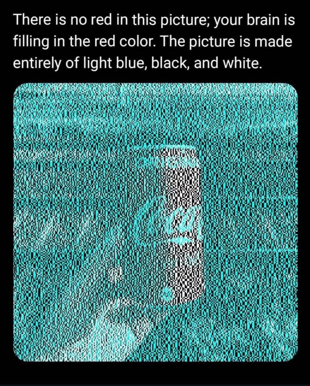
I think it’s a bit of both. The light blue color used is so called “complement color”, meaning it’s exactly the opposite on the color wheel to the Coca Cola red.
Black and white pattern suggests to our brain to play with contrast.
And of course we all know Coca Cola from all the marketing.
Btw, After staring at it for a while I can kinda switch between red and white at will. Anyone else?
Interesting :) And yes, for me it also became easy to switch once I was aware of the truth of what I was looking at.
If you look directly at the can you can see it as white, but if you look elsewhere and the can is only in your peripheral vision it seems to always be interpreted as red.
Btw, After staring at it for a while I can kinda switch between red and white at will. Anyone else?
No, that doesn’t seem to work for me, but after messing with zooming in, I can absolutely see it’s white if I’m all the way zoomed in on the black and white pixels in the can, and then as I slowly zoom out, there’s a specific moment when there’s enough of the surrounding blue that the can suddenly turns red.
The can remains black and white in my perception as long as I’m sufficiently zoomed in on it without the background. It’s a pretty neat effect.


I think it’s a bit of both. The light blue color used is so called “complement color”, meaning it’s exactly the opposite on the color wheel to the Coca Cola red. Black and white pattern suggests to our brain to play with contrast. And of course we all know Coca Cola from all the marketing.
Btw, After staring at it for a while I can kinda switch between red and white at will. Anyone else?
Interesting :) And yes, for me it also became easy to switch once I was aware of the truth of what I was looking at.
If you look directly at the can you can see it as white, but if you look elsewhere and the can is only in your peripheral vision it seems to always be interpreted as red.
At the size it is on my phone screen it looks very red. Zooming in makes it look like the red switches to white.
No, that doesn’t seem to work for me, but after messing with zooming in, I can absolutely see it’s white if I’m all the way zoomed in on the black and white pixels in the can, and then as I slowly zoom out, there’s a specific moment when there’s enough of the surrounding blue that the can suddenly turns red.
The can remains black and white in my perception as long as I’m sufficiently zoomed in on it without the background. It’s a pretty neat effect.